
What Font Is the Brat Album Cover? (Answered)
When Charli XCX released her sixth studio album, brat, in June 2024, the music was only half the story. The cover art — a flat square of eye-searing lime green with a single blurry black word stamped across the middle — became an instant internet icon. It launched a thousand memes, inspired brand campaigns around the world, and gave us the phrase “brat summer.”
And almost immediately, designers, creators, and curious fans started asking the same question: what font is the brat album cover, anyway? The answer is simpler than you might expect, and it is one of the reasons the cover works so well. Compare the real font with Brat Generator Now’s free tool
The Answer: Arial Narrow
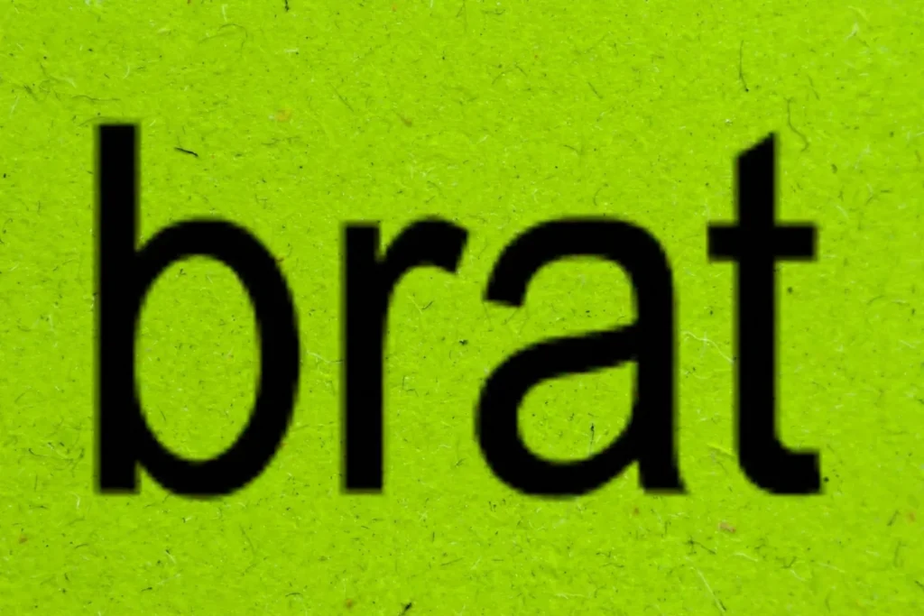
The font on the brat album cover is Arial Narrow, set in bold. Yes, really.
Not a custom typeface, not an expensive licensed font — just a plain, unglamorous system font from the Arial family that ships with most computers. On the cover, the word “brat” is set in lowercase, centered, and stretched very slightly wider than normal, which gives it that soft, slightly off-kilter feel.
Arial Narrow is a condensed version of Arial, originally designed to squeeze more characters into tight spaces like newspaper columns and spreadsheets. It is the kind of font you would find in a budget report, not on a pop star’s album cover — and that clash is exactly the point.
The cover leans into an aggressively plain, almost anti-design look, and Arial Narrow was the perfect vehicle for it.
If you open the font on your own computer, you will notice the clean version looks a little sharper and tidier than the album cover. That is because the cover text has been treated — more on that below. But the letterforms themselves, from the rounded “b” to the flat-topped “t,” are unmistakably Arial Narrow Bold.
Why It Looks Blurry
One of the first things people notice about the brat cover is that the text does not look crisp. The edges are soft and slightly pixelated, as if the image had been saved one too many times. That blurry, low-res effect is part of the cover’s raw charm.
The artwork appears to have been rendered at a small size and then scaled up, which softens the letterforms and gives them a hazy, lo-fi quality. Nothing about the cover is polished: the green is flat, the text is fuzzy, and there is not a single extra design element.
This was a deliberate rejection of the glossy, over-produced album art that dominates pop music. Instead of a bespoke visual world crafted by a design studio, the brat cover looks like something anyone could throw together in five minutes — and the blurriness sells that idea.
When you recreate the look yourself, adding a touch of blur or exporting at low resolution is what separates a convincing copy from a version that looks too clean. Aim for soft edges, not an unreadable smudge.
Free Alternatives
Here is the good news: Arial Narrow is already on most computers. It ships with Windows and macOS as part of the core font set, so there is a decent chance you own it without knowing it.
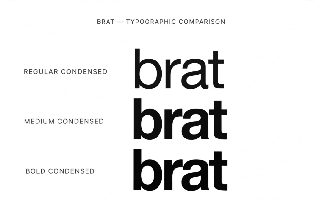
If you do not have it — or you want a font you can use freely in commercial projects — there are excellent free alternatives. Liberation Sans Narrow is metrically identical to Arial Narrow, meaning every letter takes up exactly the same space, and it is released under an open license. For most people, it is indistinguishable from the real thing.
Google Fonts also offers several condensed sans-serifs that get you close to the brat look. Archivo Narrow, Oswald, and Roboto Condensed all have that tall, narrow, no-nonsense feel.
They are free for personal and commercial use, and they work everywhere from websites to phone apps. That said, if your goal is an exact match, nothing beats the original: Arial Narrow Bold in lowercase, with a slight horizontal stretch, is the recipe — the alternatives just get you 95 percent of the way there.
How to Match the Look
Recreating the brat cover text is easy once you know the formula. Here is how to do it in any design tool:
- Type in lowercase using Arial Narrow Bold. The lowercase setting matters — the cover never uses capitals.
- Stretch the text slightly wider, to around 105–110 percent of its normal width. This subtle widening is part of what makes the cover feel slightly off in the best way.
- Center it on a brat green background. The exact shade matters more than you would think, so grab the brat green hex code before you start picking colors by eye.
- Add the blur. Apply a very slight Gaussian blur (1–2 pixels), or export your text at a small size and scale it up. You are aiming for soft edges, not an unreadable smudge.
- Keep everything else plain. No shadows, no outlines, no extra effects — the whole joke of the cover is how little design went into it.
Want the full walkthrough with every step explained? Our guide to make a brat album cover takes you through the entire process from start to finish.
Where to Download
If Arial Narrow is not on your system, you have options. Windows and Mac users can usually find it in their system fonts already — check your font manager before downloading anything, since Microsoft distributes it as part of its core font packs.
For a completely free route, download Liberation Sans Narrow or pick up Archivo Narrow from Google Fonts; both install in seconds and look the part. We have put together a full rundown of every safe source in our brat font free download guide, including direct links and installation tips for every device.
Stick to Google Fonts, your operating system’s font library, or the sources in that guide, and you will have the brat look ready to go in minutes. Avoid sketchy free-font sites that bundle installers with junk software.
The genius of the brat cover is that it hides in plain sight. The most talked-about album artwork of 2024 uses one of the most ordinary fonts ever made — and that is precisely why it works. Now that you know the secret, you can recreate it anytime.
What font is the brat album cover?
The brat album cover uses Arial Narrow Bold. The word “brat” is set in lowercase, centered, and stretched slightly wider than normal, with a blurry low-resolution effect applied on top.
Is Arial Narrow free?
Arial Narrow ships with Windows and macOS, so most people already own it at no extra cost. If you need a fully open-licensed version, Liberation Sans Narrow is metrically identical and free for any use, including commercial projects.
Why is the text blurry?
The blurry, low-res look comes from rendering the text at a small size and scaling it up, which softens the edges. It is part of the cover’s deliberately raw, anti-design aesthetic. To copy it, add a slight Gaussian blur or export your text at low resolution.
What font is closest to brat?
Liberation Sans Narrow is the closest free match because it shares Arial Narrow’s exact letter widths. On Google Fonts, Archivo Narrow and Oswald are strong alternatives with the same tall, condensed feel as the original cover text.



3 Comments