

Brat Green Hex Code & Color Palette Guide
If you have ever tried to recreate the brat album cover and something felt slightly off, the color was probably the problem. That loud, acidic green is the whole personality of the brat aesthetic, and getting it exactly right matters more than people think.
The official shade is known as brat green, and in this guide I will give you the exact hex code, the RGB values, and a full palette built around it. Whether you are designing a meme, an album cover, or just a poster for fun, this is the only color reference you need. Copy the hex code straight from our site
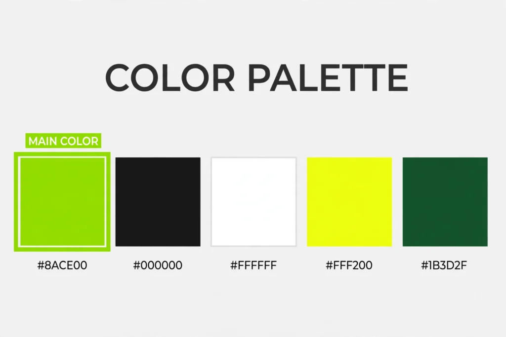
The Exact Brat Green: #8ACE00
The brat green hex code is #8ACE00. That is the shade used for the Brat album artwork, and it is the color the entire internet now associates with the brat look.
In RGB terms, that is 138, 206, 0 — a mix with a lot of green, a healthy dose of red, and zero blue. The result is a yellowish, almost neon lime green that looks deliberately harsh and cheap in the best possible way.
It helps to know the exact value because “lime green” covers a huge range of shades. Most design tools default to something like #00FF00 (pure green) or #32CD32, and both look noticeably wrong next to the real thing.
Brat green is warmer and more acidic than pure green, with that unmistakable yellowish tinge. Save #8ACE00 as a swatch in your design tool of choice so you never have to guess again.
Full Brat Color Palette
While the green gets all the attention, the full brat palette is bigger than one color. Here is the complete set of colors that show up across brat-style artwork, merch, and fan designs.
Brat green #8ACE00 is the hero color. It should dominate roughly 70 to 80 percent of any brat-style design. Everything else exists to support it.
Black #000000 is the second most important color. The album text is set in black, and black headlines, borders, and simple shapes give the green its punch. If your design feels washed out, you probably need more black.
White #FFFFFF works as a background alternative and for text placed over black areas. Some official brat merch flips the scheme to black text on white, and it still reads as brat because the typography carries the look.
Soft grays like #9A9A9A and #D4D4D4 are useful for secondary text or quiet backgrounds when pure white feels too stark. Use them sparingly so they never compete with the green.
Colors That Pair Well
Brat green is a difficult color to pair because it is so loud. The rule is simple: let it be the loudest thing in the room.
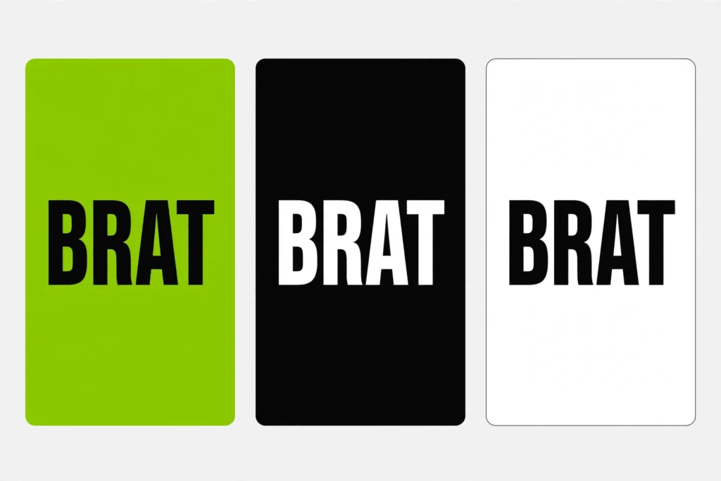
Black and white are the safest partners, and honestly the only ones you need. The original cover is just brat green with black text, and that two-color combination is the entire visual identity. White works the same way — green background with white text, or a white background with green accents.
If you want a third color, stick to neutrals. Grays, off-whites, and near-blacks will not fight the green. A soft gray background with brat green headlines looks clean and modern while keeping the brat energy intact.
What about other bright colors? In general, avoid them. Red, orange, or hot pink next to #8ACE00 creates a clashing, muddy mess that reads as a mistake rather than a statement. The whole point of the brat look is restraint everywhere except the green.
Using the Palette in Designs
Knowing the hex code is only half the job. Here is how to actually use the palette in real designs.
Start with the green as your background. The classic brat look is a full-bleed #8ACE00 background with centered black text in a plain sans-serif font. If you want to make a brat album cover of your own, that is the formula — green field, simple text, nothing else competing for attention.
Use black for text and key shapes. Headlines, body text, borders, and simple graphics all work best in black. It has the strongest contrast against the green and keeps everything readable at any size.
Reserve white for breathing room. A white section between green blocks, or white text on a black band, breaks up longer designs without diluting the identity.
Test your colors on real screens. #8ACE00 looks different on a phone, a laptop, and a cheap monitor. Check your design on at least two devices before you call it done, especially if it is going on merch or print, where the green can shift toward yellow.
Finally, keep the layout simple. The brat font and the green do the heavy lifting, so resist the urge to add gradients, shadows, or textures. Flat color and plain type is the whole aesthetic.
Common Mistakes
The most common mistake is using the wrong green. If your design looks like a tennis ball or a highlighter, your green is too yellow or too bright. Compare it side by side with #8ACE00 and adjust until they match.
The second mistake is adding too many colors. Every extra color weakens the green’s impact. If your palette has more than three colors, cut something.
Third: low-contrast text. Dark gray text on brat green might look fine in your editor but becomes unreadable on a phone in sunlight. Stick to black text on green, or white text on black.
Fourth: overdesigning. Drop shadows, gradients, and textured backgrounds all fight the flat, blunt look that makes brat recognizable. When in doubt, take something away.
And finally, do not forget the vibe. The brat look is about seeming deliberately unpolished — a design that is too clean and corporate misses the point even with the right colors.
Conclusion
That is the complete guide: #8ACE00, RGB 138, 206, 0, supported by black and white with a few neutrals for backup. Save the swatches, keep the layout simple, and let the green do the talking. Get the color right and everything else falls into place.
What is the brat green hex code?
The brat green hex code is #8ACE00. It is the exact shade used on Charli XCX’s Brat album cover. In RGB, that is 138, 206, 0.
What colors go with brat green?
Black and white are the classic pairings — the original cover uses black text on the green. Grays and off-whites also work well as neutrals. Avoid other bright colors, which tend to clash with it.
What is the RGB value of brat green?
The RGB value of brat green is 138, 206, 0. That means 138 red, 206 green, and 0 blue. Use these values in any design tool that does not accept hex codes.
Why does my green look wrong?
You are probably using a generic lime green like #00FF00 or #32CD32 instead of #8ACE00. Brat green is warmer and more yellowish than pure green. Compare your shade side by side with #8ACE00 and adjust until they match.


4 Comments